Unravelling the mysteries behind our logo

We are writing this short story in memory of our colleague Andrei, who passed away last year because of depression and panic attacks. Andrei designed our final logo and made sure that it represented us completely in a more modern twist of design and colours.
A logo is the first thing people see, and it should encapsulate the essence, values, and mission of an organisation. A well-designed logo can communicate the organisation’s identity at a glance, creating a solid first impression.
When we created the logo for our art organisation, we thought of something that would capture the essence of our creativity, expression, and identity.
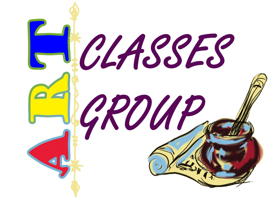
In the initial stage, we designed our logo in Photoshop and we played with the typography of our name and a few illustrated elements related to our visual art practice like folded paper, an ink jar and a pen. We focused more on the graphic part of the design than thinking of the colour palette and its symbolic attributes.
After only a year and a deeper consideration, we decided to change the logo in order to encapsulate more elements that represented the core principles of our organisation.
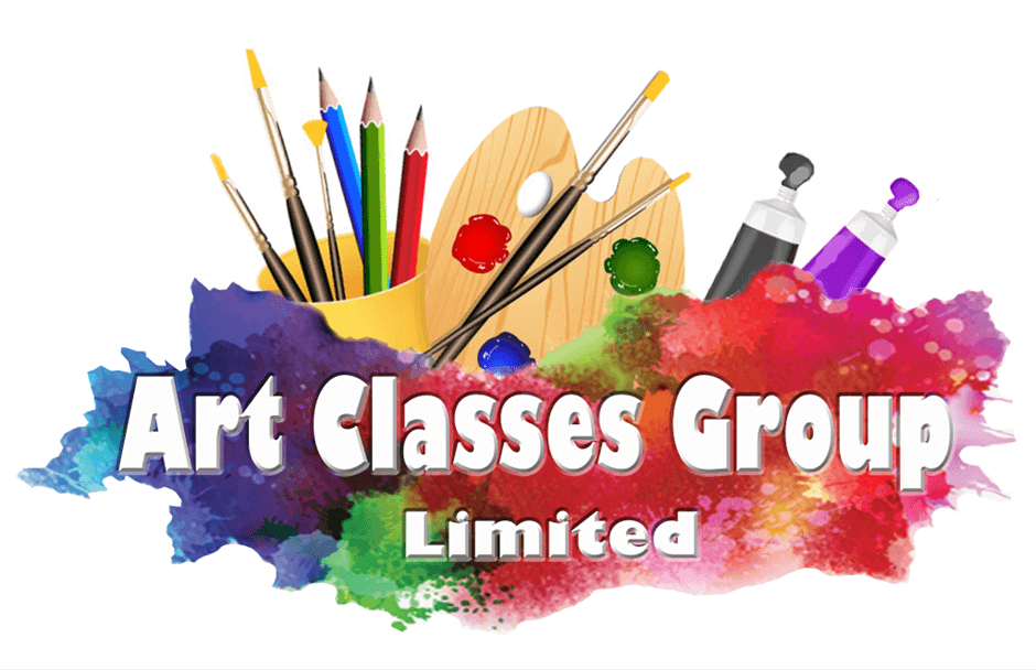
We incorporated paint brushes, painting palettes, colour tubes, pencils and a water pot. We designed the logo in Photoshop and we added a splash of colour around the text.
This was the design that we thought would be final and that would represent us for as long as possible. We received mixed feedback like ‘this is the best logo that represents your organisation’, or that it is ‘too traditional and too figurative’.
This is the part when Andrei, who worked as a graphic and web designer, decided that this logo had to be changed into a memorable logo to help establish brand recognition. When people see the logo repeatedly, they start associating it with the organisation and its core activities. This association builds trust and loyalty among the audience, leading to increased engagement and support and he started to work on different versions of it starting from our initial designs.
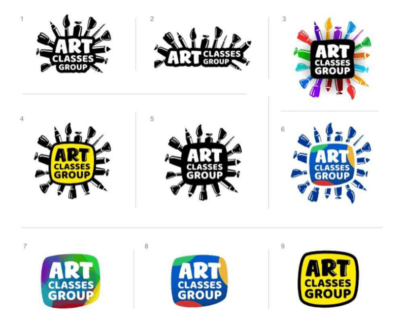
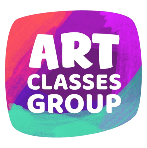
It sounded exciting to see the new designs and we loved all of them which made a very difficult decision on which design to go further. Andrei suggested that the simpler the design, the easier it would be to memorise and so we went ahead with versions 7 and 8 and it was left to decide on the colour scheme. We decided to have a combination of red which symbolises our passion and energy for the work that we deliver, the indigo which symbolises devotion, wisdom and justice that we will always strive for and turquoise as a symbol of calmness and clarity of our work.
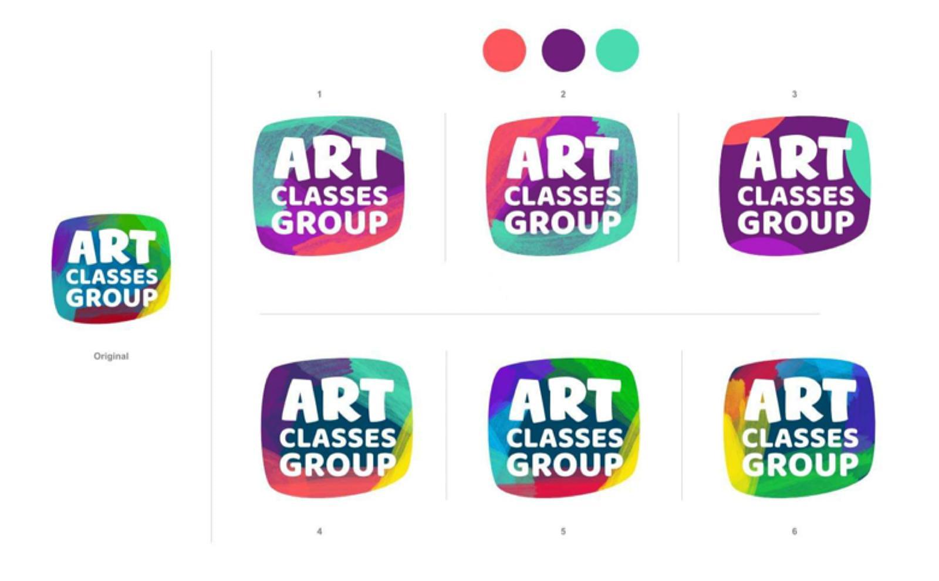
And here we are with the final design: clear, powerful and with the perfect colour combination.
Designing our organisation’s logo was the last work of Andrei before he suffered the final panic attack that made him take his life at only 37 years old.
We hope that this logo will represent his legacy that will survive through time, and it will align his work with other representative organisations from the artistic field. We hope that the logo will remain timeless. While trends come and go, a timeless logo retains its relevance and effectiveness over the years. It withstands the test of time and remains recognisable and impactful regardless of changing design trends.
We learned that a professionally designed logo reflects the professionalism and credibility of our art organisation. It shows our mission and core values.